Bina Altera | Graphic Designer
binaaltera@gmail.com | 917-887-5884 | LinkedIn
Rob Is Coaching
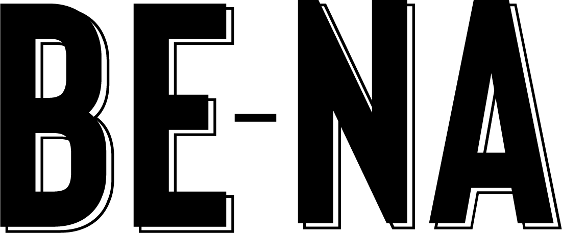
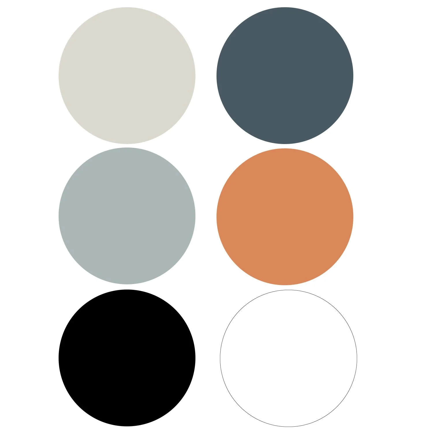
Brand Tone: Transformation, Peaceful, GroundedWork: Brand Identity, Photography, WebsiteRob Is Coaching empowers individuals on their journeys of self-discovery and conscious expansion through personalized life coaching, breathwork, and psychedelic integration. The brand identity reflects these values. A unique logotype using a custom made letter "O" and "A" symbolize the personal attention you'll receive. The soft color palette using an earthy blue evoke feelings of peace and tranquility, while a touch of orange signifies transformation (fire). The custom letters are also used as logos. We chose to do the photoshoot locally and at Rob's home bringing in elements of home into the brand and throughout the website. The sky image used as a supporting graphic reflects the awe-inspiring limitless potential within you.


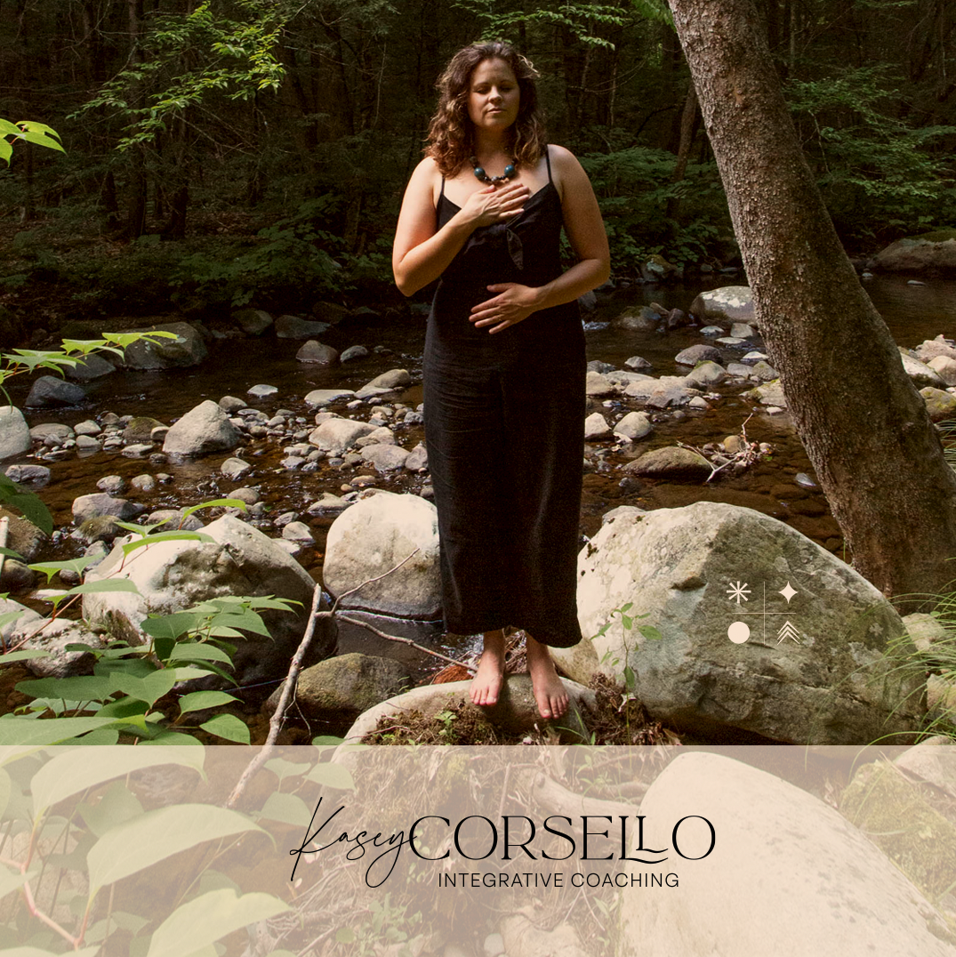
Kasey Corsello Integrative Coaching
Brand Tone: Regenerative, Invigorated, RootedWork: Brand Identity, Photography, WebsiteKasey Corsello, an integrative and cultural intelligence coach, empowers individuals to flourish. Inspired by her multi-faceted life, we crafted a brand identity that reflects her holistic and nurturing approach. A dual-font logotype embodies Kasey's warmth (script) and supportive guidance (interlocking serifs), while a vibrant blue, inspired by her transformative time lived in Italy. Custom symbols were created – circle (wholeness), arrow (freedom), diamond (possibility), star (integration) – represent her core coaching pillars. Candid photography showcases Kasey's genuine connection to nature, mirroring her grounded and growth-oriented approach. This brand identity resonates with Kasey's target audience, conveying warmth, authenticity, and a deep connection to the natural world – values integral to her services.


Altru Center
Brand Tone: Inclusive, Heart-Centered, CommunityWork: Brand IdentityThe Altru Center, a NYC-based non-profit, offers educational programs in personal development and community leadership. They envision a world united in peace and love, where diverse individuals collaborate for both collective well-being and personal fulfillment. Their logo reflects these values. A bold, sans-serif font ensures clarity at any size, while a red heart reinforces the concept of altruism. The two-color design emphasizes "AL" and "Tru," potentially signifying the start ("AL") of a new path ("Tru") towards a better world. A script font in the tagline underscores the importance of human connection in their mission.


Tracy White Coaching
Brand Tone: Empathy, Collaboration, VibrantWork: Brand IdentityTracy White, a Transformational Coach, ignites your potential for vibrant relationships and holistic wellness. Her collaborative and empathetic approach empowers you to explore, reflect, and take action in a safe and inclusive space. Tracy champions diversity and fosters individuality, allowing you to truly "Shine Your Light."
Tracy White's brand identity seamlessly reflects her core values. The unique typeface, both sophisticated and approachable, embodies the empowerment she fosters in her clients. The color palette, a harmonious blend of rich gold, warm purple, and sparks of light orange and brown, establishes a visually striking and versatile foundation for all marketing materials, digital or printed. Evocative imagery, hinting at a touch of magic and boundless potential, further reinforces the transformative journey that Tracy guides individuals on. Additionally, a custom badge and graphical star element elevate the brand identity, providing a variety of design options for consistent and impactful communication across platforms.


