


Brand Tone: Regenerative, Invigorated, Rooted
Work: Brand Identity, Photography, Website
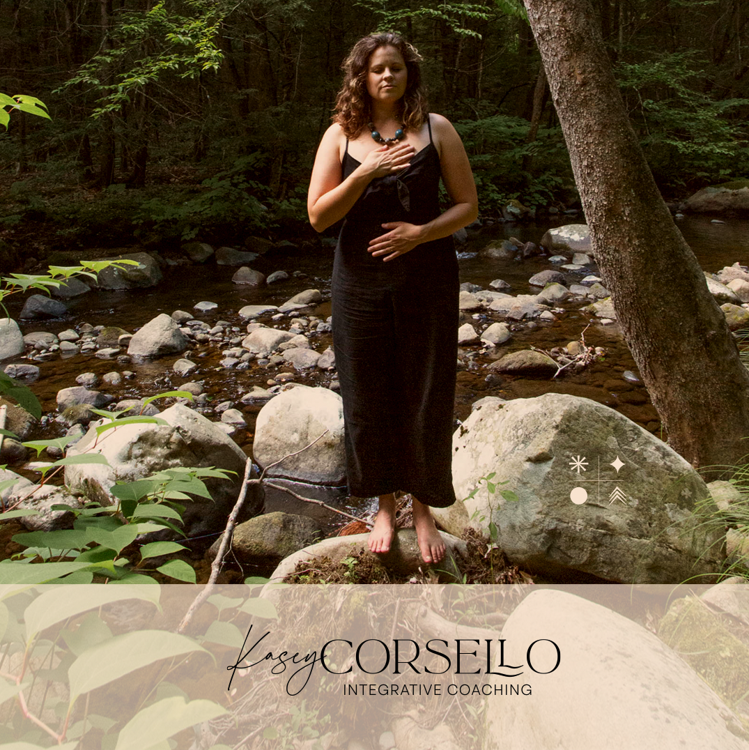
Kasey Corsello is an integrative and cultural intelligence coach who is passionate about supporting people in being the best version of themselves. In our discovery call, we learned about her coaching business and clients, her partnership with her husband in Corsello Butcheria, how much she loves being a mother and her deep connection to their land. All of these things are important and interconnected for her, so we set out to create a brand story that would reflect her commitment to all of it.
Creative director, Bina Altera, spent a weekend taking photographs in the woods surrounding Kasey’s home in Western Massachusetts and developed the brand elements and web site using the photos. The photo shoot was spontaneous and candid so that Kasey's audience would see her surrounded by nature and rooted on her land— a metaphor for how she connects with her clients. The main brand colors are in a neutral palette that complement the natural settings in the photos.
For the wordmark, we integrated two fonts. One is a script font reflecting Kasey’s personal style and attention to her clients. The other, a serif font, in which two L's are nestled in with each other is meant to indicate how she holds space for her clients. Inspired by the vibrant, colorful homes in Italy, where Kasey had a life-changing experiences, we opted to make it in a bright blue.The four custom symbols signify the four pillars of her coaching: The circle represents wholeness, the arrow represents freedom, the diamond represents possibility, and the star represents integration. We also designed a logo, badge and initials that can be used for print or digital materials.